
Release: 16-11-2011
- New mobile ad template
- Mobile demo webpage
 New mobile ad template
Nowadays it isn't news anymore, but mobile ads are booming. This is why we have put our focus also on various mobile projects lately. In the hereby described release we are going to reveal one of our developments in the mobile field: a creative template for serving ads on mobile-optimised webpages.
AdOcean delivers ads in browser by using JavaScript codes. As smartphones and tablets are taking reign over the mobile world, possibilities are also getting more diverse. Smartphones and tablets have browsers that work in many aspects similarly to their desktop counterparts (despite some significant differences, too). Most importantly, however, they have already significant JavaScript support, in order to let you deliver ads on mobile optimised websites. When it comes to our newly developed mobile ad template, we were focusing on the following features:
- make it possible to deliver image ads (Flash is not supported on several devices, e.g. iPhone)
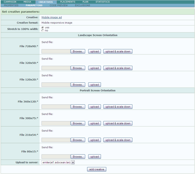
- let traffickers upload images for an ad in various sizes and make AO deliver the one which fits a given mobile screen estate the best (currently available landscape sizes: 728x90, 320x50, 120x20; portrait sizes: 360x120, 300x75, 216x54, 80x15)
- make it possible to upload only one image and automatically downscale it to smaller image dimensions – a useful feature if there is no creative capacity to make fine-adjusted version for all sizes
- scaling: pick not only the image size, which is closest to a webpage visitor’s mobile screen size, but make it also possible to scale the delivered image automatically and stretch it to full width of the display
- dynamically adjust scaling whenever the mobile display is rotated, i.e. when screen width changes effectively
The new template, called ‘Mobile responsive image’, achieves all of the above goals. The image below shows the new template’s parameter page, where the images of different sizes may be uploaded:
Uploading is done by clicking one of these 2 buttons next to a file field:
- upload
- upload & scale down
- You are able to define different images with AdOcean's mobile creative template, with various image size and design for various screen dimensions and orientations (portrait or landscape).
- When loading a webpage, AdOcean's mobile ad template picks the default image, which is defined for the delivered creative and sets image width to 100%. Then, if the browser supports JavaScript, the image is automatically updated to fit the browser's dimensions. In case of non-scaled ads the image is not going to be stretched to fit exactly to the browser's dimensions.
- The creative code reacts to zooming (scaling) in the page and rotation of the device. When one of these events occurs, the ad is automatically substituted and resized to fit the new size and orientation.
The ‘upload’ button sets the selected image only for the given size slot. If the selected image does not fit the size exactly then the system automatically resizes it.
The ‘upload & scale down’ button sets the selected image for the given size slot, but it also sets its resized copy for all of the lower size slots as well. In other words, if you have only one large image for the landscape ad then you can upload it and also let the system resize it for you at the same time for the smaller versions. Please note that this button is not available at the smallest size for landscape and portrait orientation, as it there is no size below to downscale further to.
When uploading one or more images (either one by one or by using the 'upload & scale down' button) they become visible immediately, as kind of an instant preview. Thus you may check their proportions and any possible distortions as a result of resizing. Uploaded files may be removed any time by clicking the ‘delete file’ link next to file upload fields.
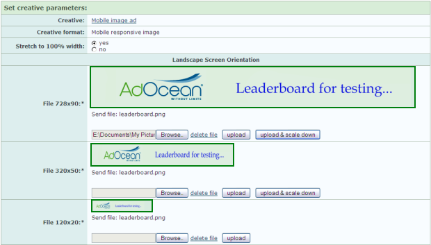
The image above shows a case when the user selected only one image for the 728x90 size slot and clicked the ‘upload & scale down’ button. Not only does the selected image become visible for a preview, but also the resized copies for the lower size slots. If the user got later on an image, prepared by the creative agency, in exactly 320x50 size, it would be possible to upload only that image and leave the other copies intact. Please note that the ‘Stretch to 100% width’ option is set to yes in this example. It results in not only picking the image for delivery, which will be closest in proportions to a mobile webpage visitor’s display size, but if the image doesn’t fit the mobile’s screen width exactly, it will be stretched accordingly to fill in the available width.
To sum up, this is how the new ‘Mobile responsive image’ creative template works:
We are rolling out this feature for an initial, public test phase, in order to work out any possible problems before the final solution. If you would like to send your feedback about it, please contact your local Gemius representative or our Sales Department. After the initial tests this feature will become available as an additional feature of AdOcean (pricing to be announced later).
Mobile demo webpage
We have preapred a webpage to showcase how our mobile responsive image ads work. Please visit the following URL with your mobile device:
Please note that another ongoing mobile project we have is also described at the bottom of the mobile demo webpage. We leave it up to you to discover it, in case you didn't hear about it yet.